|
|
 |
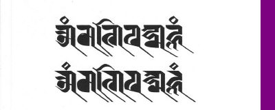
L A N T S H A ( L A N Y D Z A ) Lantsha which developed in the 11th century is an artistic graphic script, similar to the Ranjana script, and is used as a holy script . Tibetans use this decorative script for writing mantras und the title of a sadhana which has been translated from Sanskrit into Tibetan. Many Sanskrit texts and manuscripts are written in Lantsha. In the monasteries of Tibet Lantsha serves as decoration on murals, is printed or signed on mandalas, and is the script chosen to write bija mantras ("root syllables").
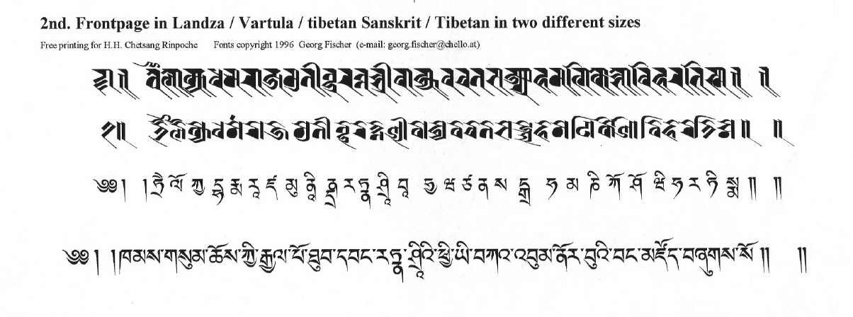
Tibetan text pages are known as "pecha". According to Tibetan tradition, "pecha", were written by hand or printed from wood-blocks. The text on the front page will have up to 4 lines written in a fancier style then the normal pages.
The first line, - the title in Sanskrit, is in Lantsha script, in black ink. In the second line the same Sanskrit text will be rendered in Vartu script, which is a rounder, headless form of Lantsha, also in black ink. The third line will be in a Tibetan script ( there are several styles of Tibetan writing ), usual in dbu can style, in red ink. In the last line the Tibetan translation of the Sanskrit text appears in black ink.
Lantsha is written from left to right along a virtual horizontal bar, hanging on an imaginary line with no spaces are between words. The writing system is the same as for Ranjana. A single or double vertical line called "danda" is used to indicate the end of a phrase or sentence.
Before you can begin to practice Lantsha calligraphy there are many minute details and some difficult things to learn about Lantsha formatting.
You need time to understand these and then to put your knowledge about Lantsha letters into practice. Competence in writing is a basic requirement on your way to master Lantsha script so that you can produce authentic Lantsha texts. Often, when we write, we write without much thought. The best way for calligraphy is not to think of it as writing, but as drawing the signs. In calligraphy Lantsha the exact shape of any consonant or ligatures matters a great deal. The placement of the consonants on a "headline", its placement next to the other, the angle and the slope of the line, the angle of our hand, all that will influence the look of the finished page. Look at the shape of each single sign and draw it as a free-standing form, like an icon. During the age old history of Lantsha script, you can clearly see how the wrting tools and materials used have affected the looks of the consonants and ligatures.
When writing Lantsha, you cannot give every character exactly the same amount of horizontal space. Nevertheless, you should make sure that the vertical strokes of the consonants and the ligatures have the right proportions. This can be achieved only by repeated efforts und by careful comparison with characters written by expert calligraphers. The first exercise is to learn the structure of the various consonants and ligatures. After becoming familiar with more conjuncts, other ligatures similar in writing demonstrate the principles of the different stroke structure. Calligraphy Lantsha is not only a practical technique for writing the signs, but also a capability of showing expression and a way of achieving discipline. Through calligraphy and understanding the forms of the conjuncts you can feel how they infuse in Tibetan art and culture.
|
|